Hey Barista
The go-to-app for coffee lovers
B2C
Hospitality — Lifestyle — FoodTech
Malmö — SWE
Services we provided
Design
Development
Deliverables
Mobile App (iOS / Android)
Team involved
Cecilia Teisaire
Producer
Pablo Caravaca
Visual Designer
Pablo Funcia
Product Designer
Andrés Calero
React Native Developer
Fran Portillo
Devops Engineer
Lucía Guillén
Lead Product Designer
Luisa Jara
Product & Motion Designer
RECOGNITIONS
Summary
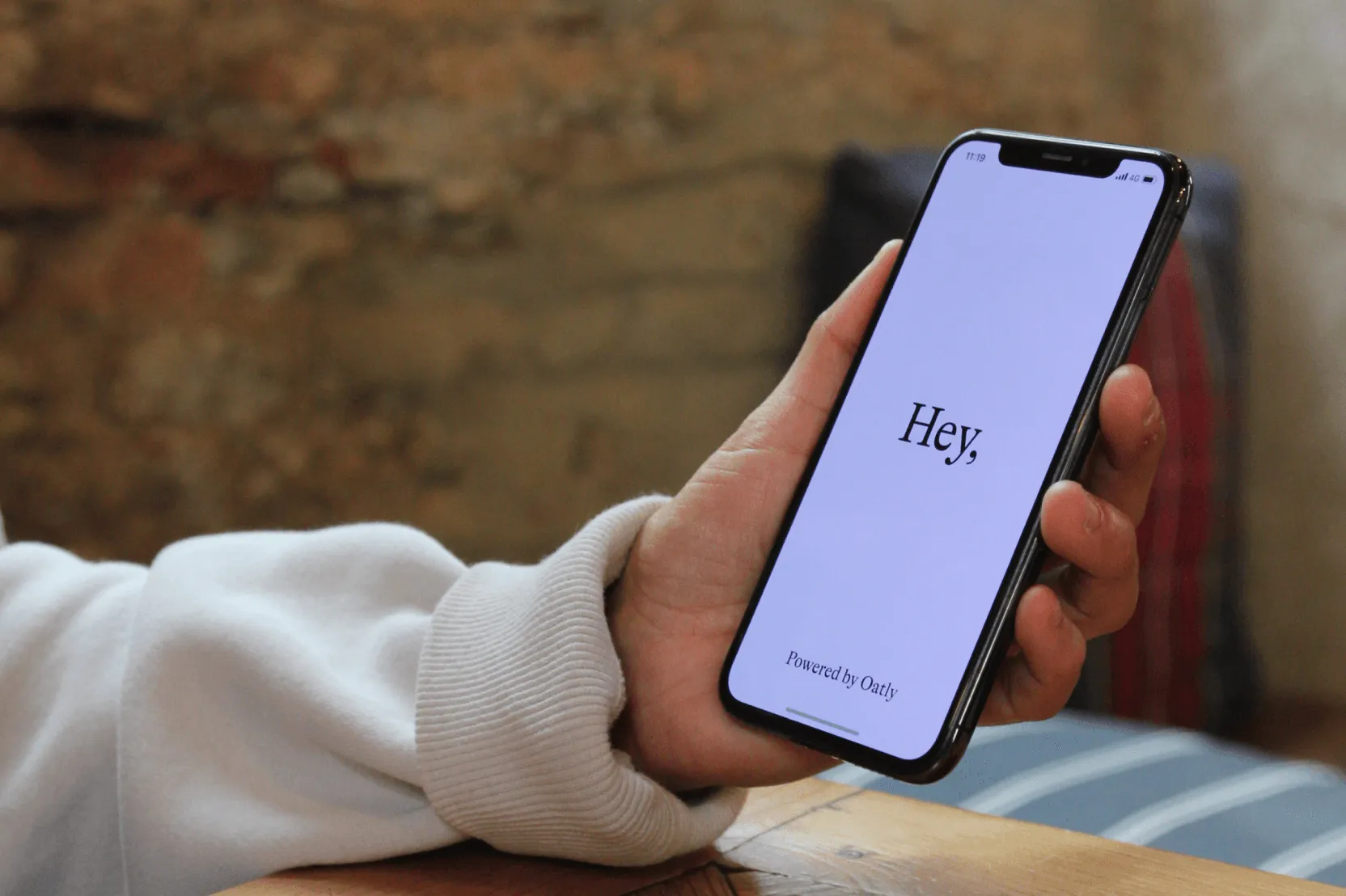
Hey Barista began as an annual print magazine by the world-famous oat milk company Oatly. It was their way to promote specialty coffee and engage with coffee lovers, sharing stories about their “passions, musings, and more.” Sometime later, it evolved into an online publication.
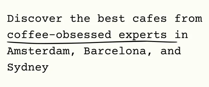
Now, we’ve joined forces with the Oatly team to elevate Hey Barista into an app that you can use to find the best cafés in town, curated by coffee-obsessed experts, and access the latest featured stories of the online magazine.
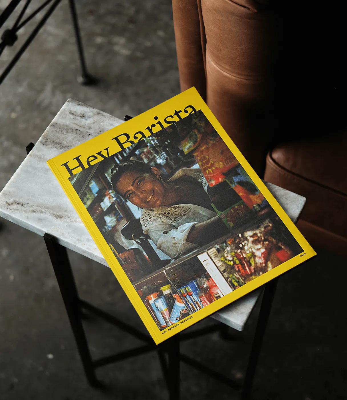
A print magazine as the starting point
Specialty coffee production is linked to specific regions,
encouraging the prosperity of local communities and businesses. In
contrast with regular coffee, it identifies with traceability,
authenticity, and, most important, sustainability. That's why
it's so relevant to promote it in as many ways as possible.
Hey Barista was born as a cool magazine, the kind of
publication that’s a delight for the eyes. Targeting those in love
with caffeine, it covered stories about baristas around the globe.
Concerned about the limitations of paper, the Oatly team soon
decided to create the publication's online version.
An app with extra creaminess
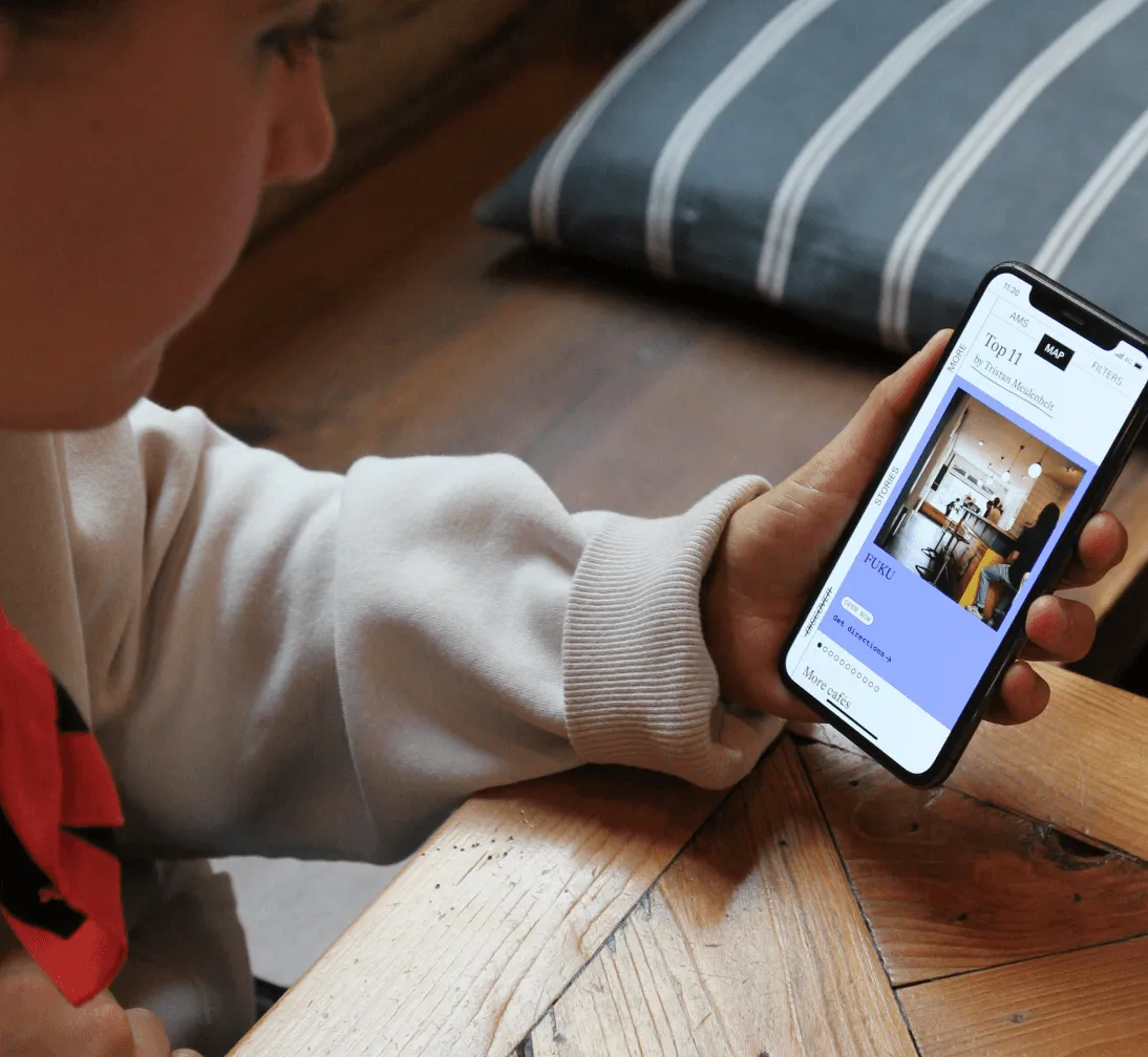
Roughly, the main goal of the Hey Barista app is to serve coffee
lovers by listing the best cafés in town and being able to
geolocalize them on the map. These lists are not just any lists. They
are carefully curated by an expert barista in each city, who you can
get to know by checking their profiles also on the app.
“We started by composing a moodboard with loads of refreshing interactions. We wanted to give a twist to how the maps are usually shown, make it more original, and not stick to the typical integration with Google Maps.”
Lucía Guillén, Lead Product Designer at Z1.
Oatly entrusted us with the app design and gave us tons of creative freedom. The only premise they set was to follow the brand guidelines of the Hey Barista publication. This branding is impactful, with solid colors and a magnificent use of typography. We automatically fell in love with it, taking advantage of its vibes for the look & feel of the app.

Commitment to accessibility
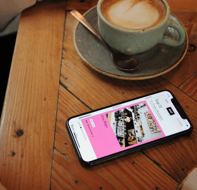
Hey Barista's UI is pretty effective, with three sections:
Discover, Stories, and Profile. Our main challenge was meeting
accessibility and navigation standards while keeping their
distinctive ‘underground style.’
We faced the dilemma
of whether to use the remarkable vertical navigation and
strikethrough in the selections they employ on the online
publication. Even though those are not the most accessible of the
patterns, we decided to give it a go and maintain these branding
elements, locating ‘Discover’, the main section of the app and the
most used, in the lower left corner of the screen, which is also
the handiest.
We incorporated other beautiful details
into the app, such as handwriting effects on maps, delightful
iterations, and fun error and loading screens.
“We took advantage of the Hey Barista branding in an interactive way. We played with the screens that are usually relegated to the merely functional, such as the loading and error screens, making them more fun.”
Lucía Guillén, Lead Product Designer at Z1.
Coordinating development and marketing
efforts
Oatly was preparing the Hey Barista launch marketing campaign while
we were finishing developing the app. We had to ensure the product
was tested and working perfectly to submit it to the stores for
approval with enough time.
We committed to developing the
Hey Barista app within one month, and we succeeded thanks to fluid
and constant communication with the Oatly team, with whom we had to
synchronize to adapt the design and prioritize functionalities to
our limited deadline.
Regarding technologies, we used Django for the backend and React Native for the frontend. Both development teams worked side by side, maintaining impeccable daily coordination to ensure that the V1 came out on time and bug-proof.
What’s next
With 6K+ downloads in the first month after its launch, Hey
Barista is receiving so much positive feedback. People compliment
the look and feel and how helpful it is to discover new coffee
spots.
We've truly enjoyed this project, not only
in terms of design and development but also in terms of working
with Oatly, whose mission of making it easy for people to
live healthier lives without recklessly taxing the planet’s
resources
resonates so deeply with us.
It has been a true
partnership in action, the way we love to craft digital products,
ideating and building together, and trusting in each other. And
the fact is that we are still working together, coming up with new
features to amplify the app’s scope and feeling that caffeine
excitement about the future to come. In the meantime…
Enjoy your coffee app ;-)
TheDarkEnergist, 11/17/2023
Love it
Really enjoying it so far. Great design and vibe. Bravo!
Gotajibbo, 11/15/2023
Incredible app
Absolutely love the design and functionality of this app...I’ve already checked out 4 of the cafes
“We are very grateful for the great work done by the Z1 team, always with a smile and willingness to find solutions.”
Cedric Gairard, Oatly's Head of Production.
